Making stock…
Surely, you are taking stock…
No, absolutely not. I am taking the carcass from our roast chicken and making a pint of stock. All in 28 minutes. Got to love microwaves.
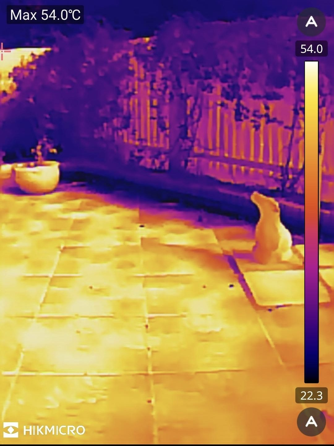
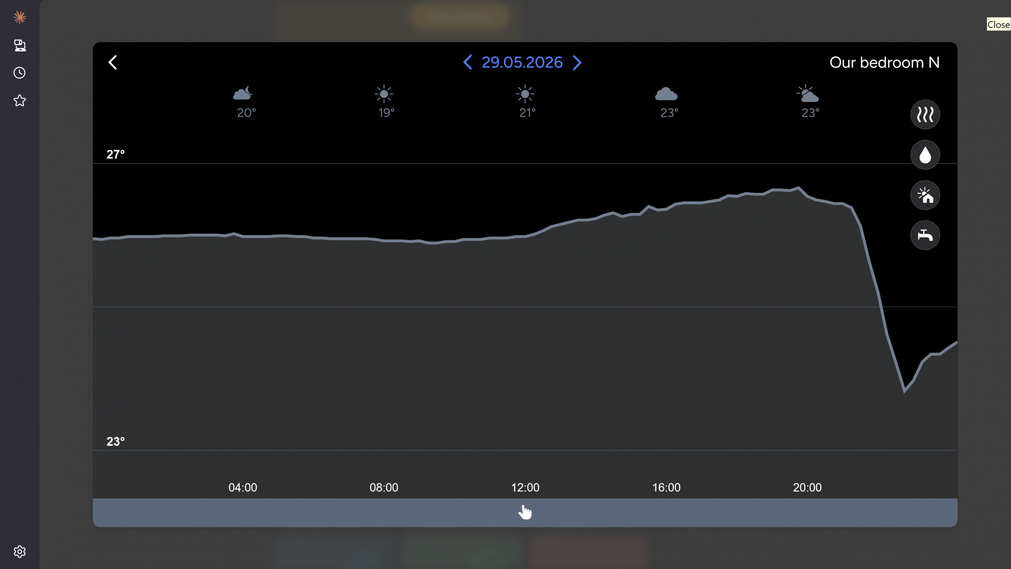
In fact, from an eco point of view, it’s not been a bad few days. After four brilliant solar generation days, we have had some cloud the past couple, and we still have some power in our battery. All thanks to the power house of a cooker in the corner of our kitchen.
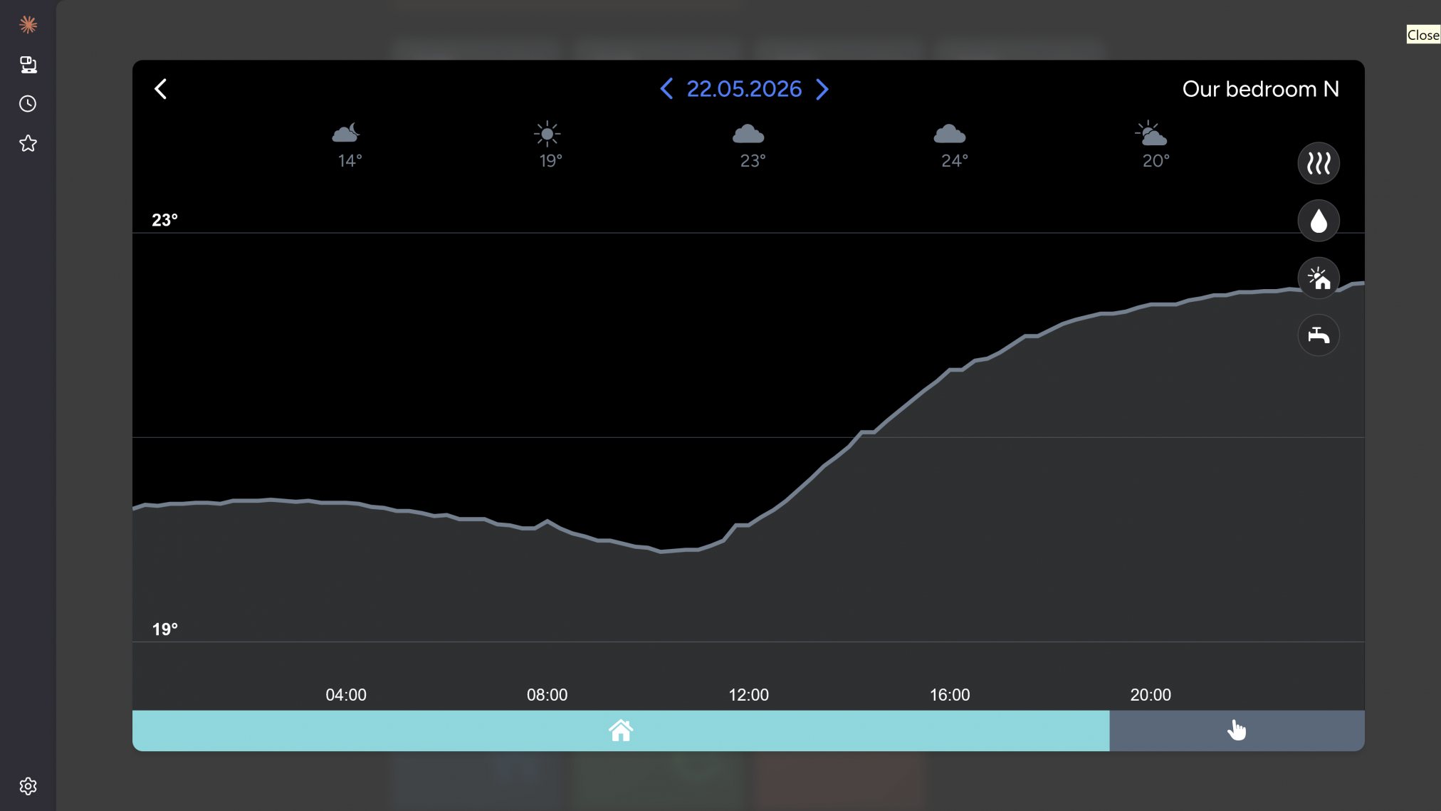
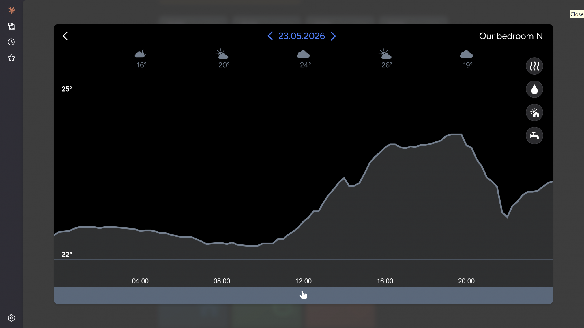
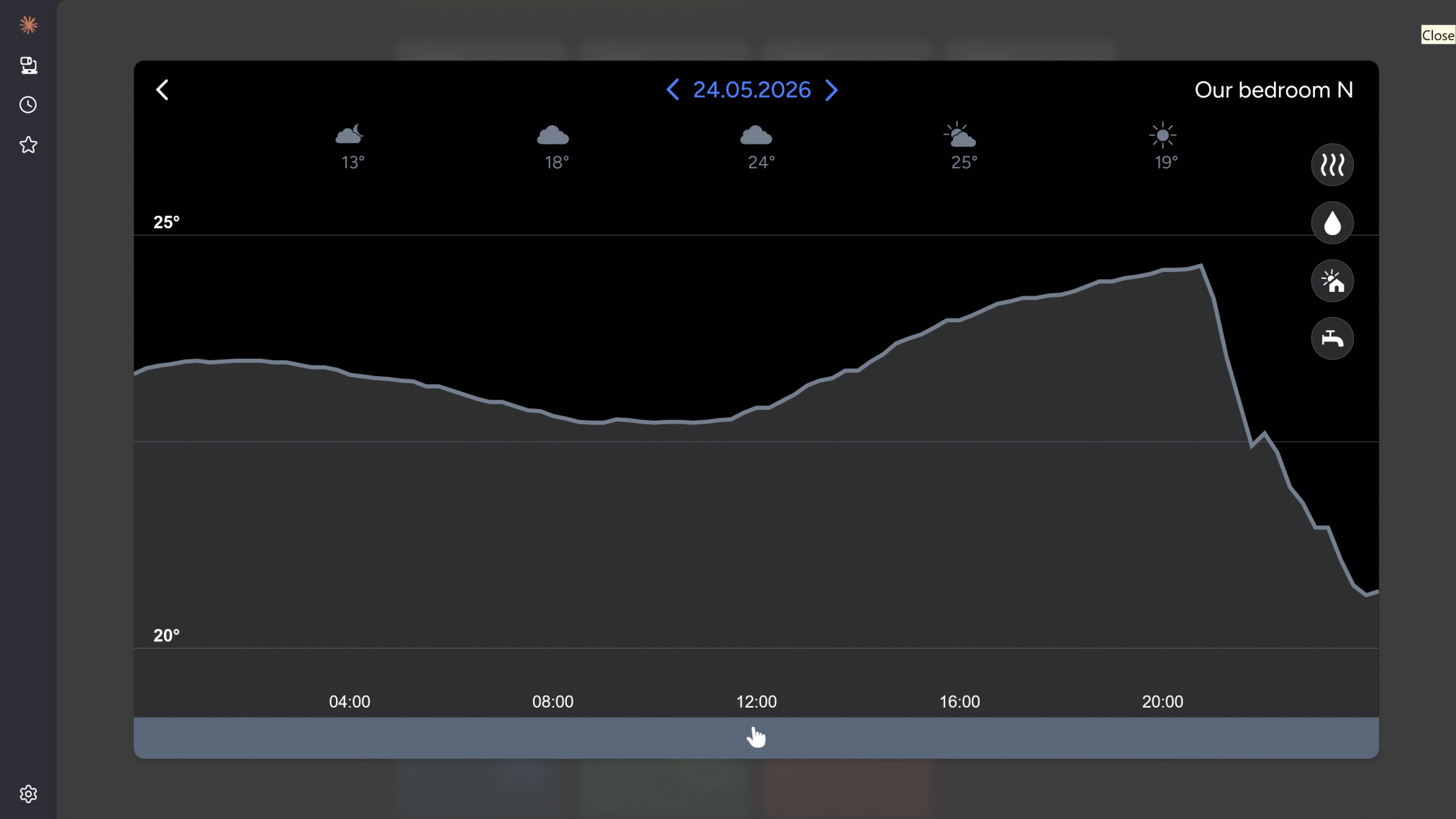
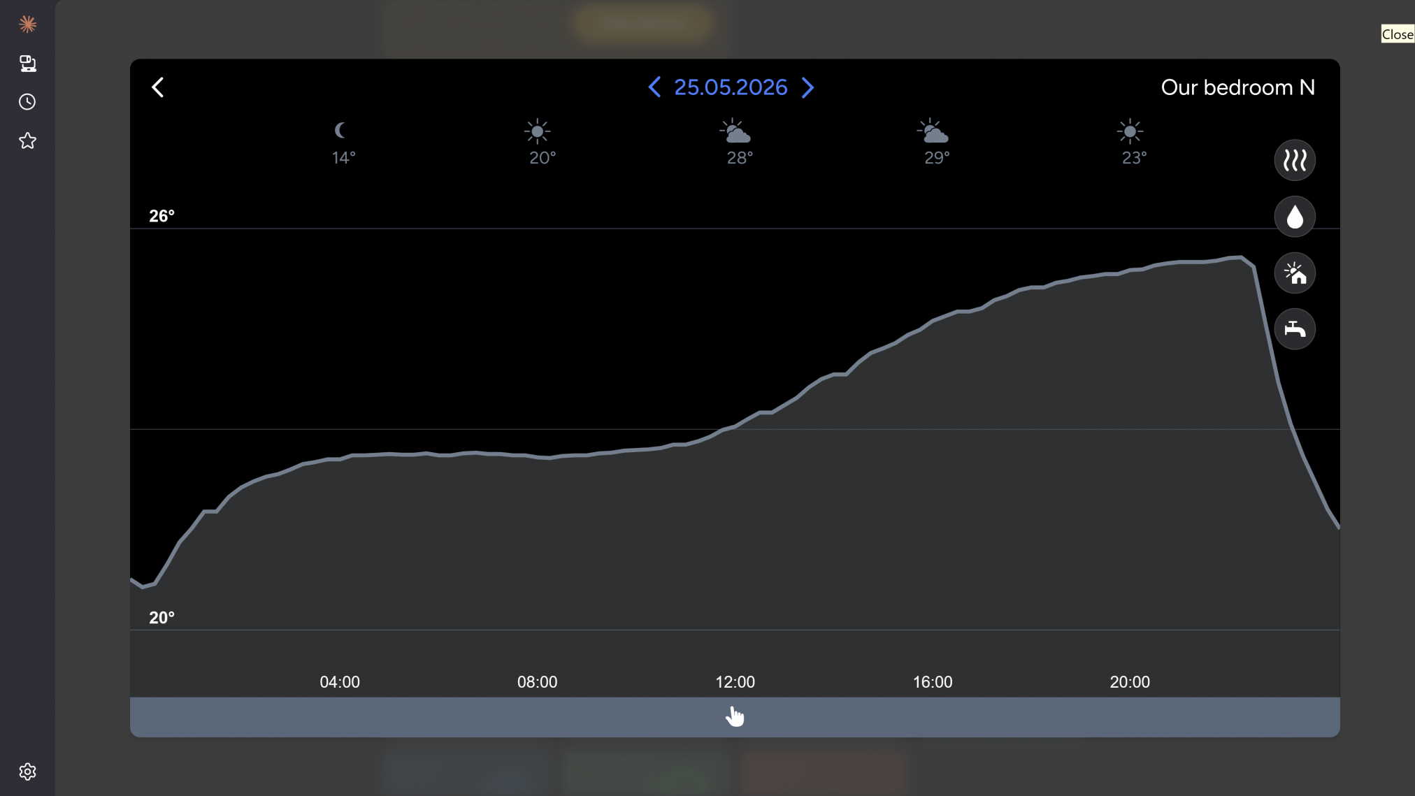
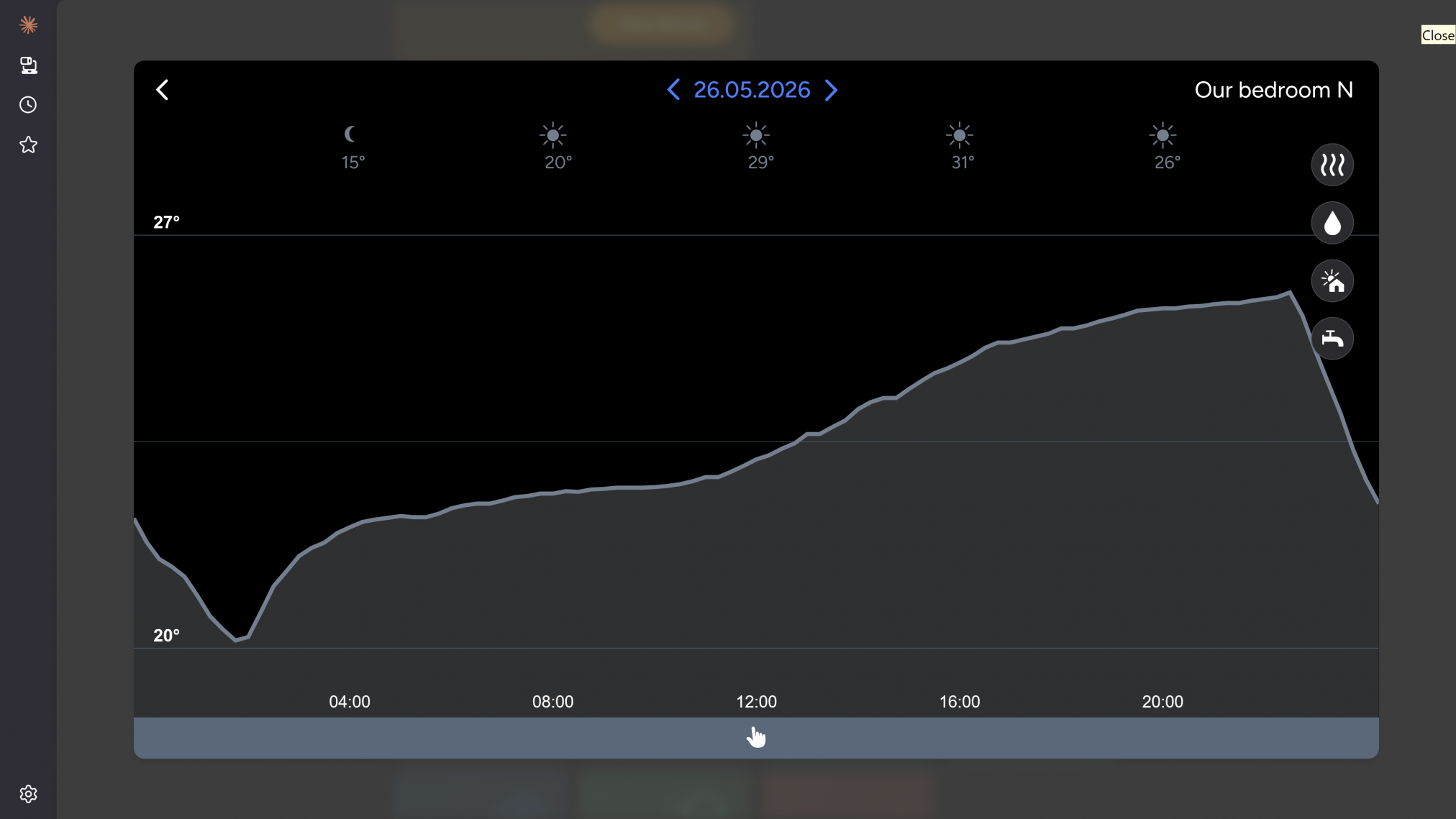
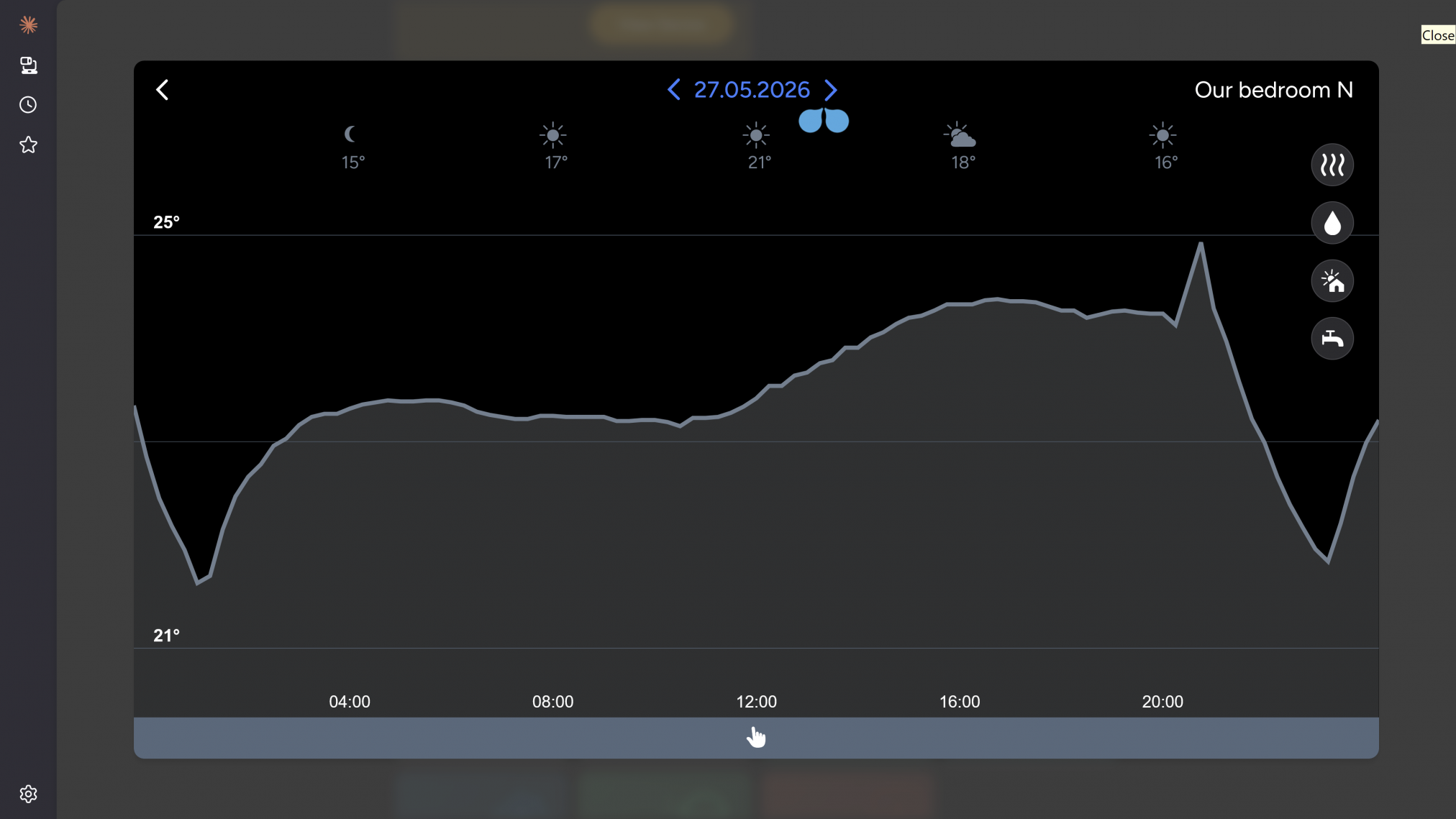
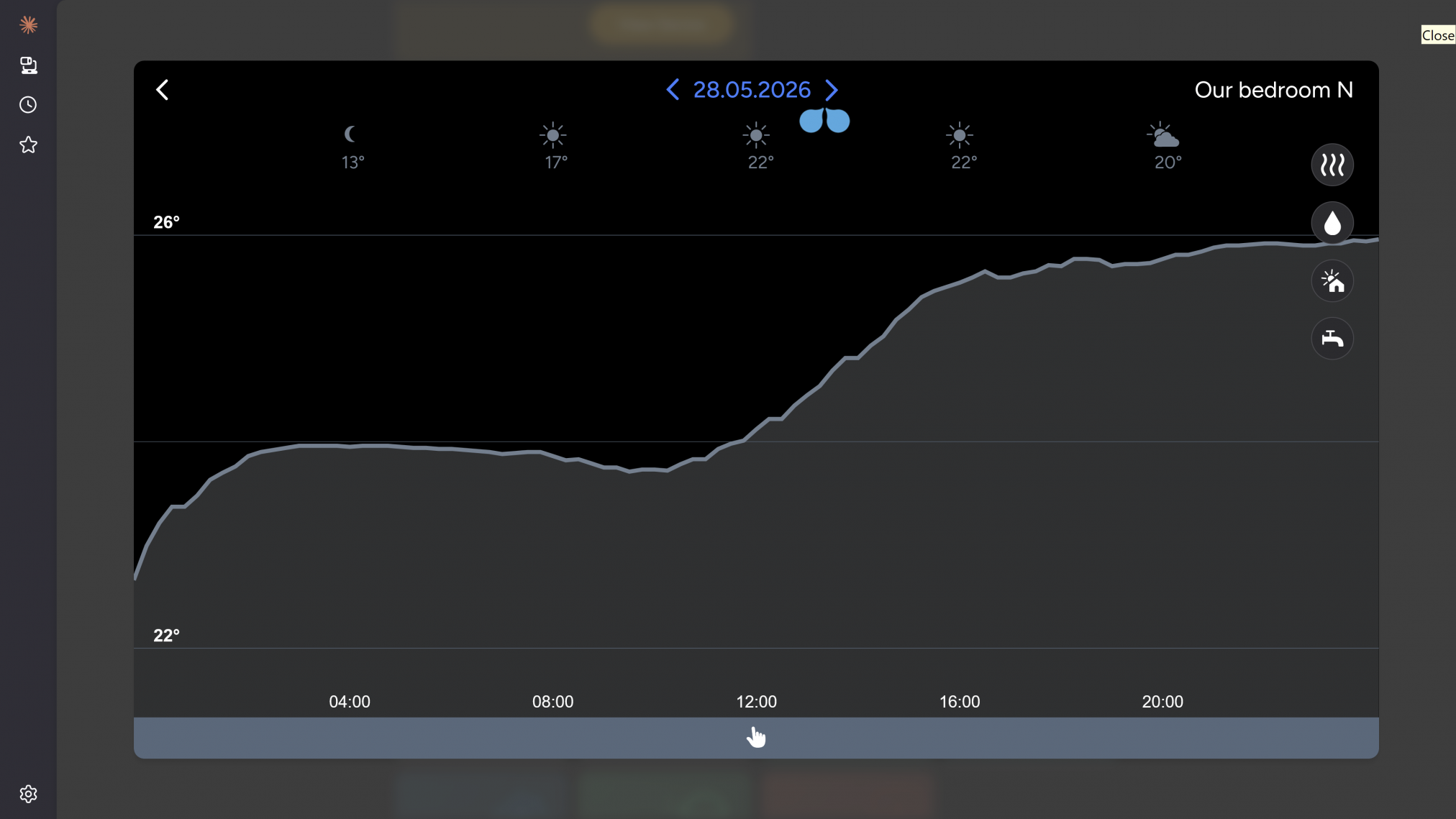
The heat pump is doing its part and keeping the water warm: our room thermostats and insulation mean that the radiators do not come on again until the rooms cool down considerably. Our water is a barmy 57°C, all thanks to the heat exchanger in the heat pump. So far today we have spent (including VAT), 5p on heating our hot water, only we haven’t because we have been using the battery and our solar generated energy to do that for us.
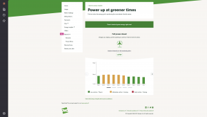
Which is the thing at the moment. We’re not the only ones benefiting from the investment made in renewable energy sources. A south facing system 4.5kW in the UK generally saves you £575 per annum in 2026. Such a system, including fitting, typically costs around £8,000: which gives you a pay back of 13 years. Probably less, as energy prices are likely to rise in reaction to the cost of petrol.
We were asked by our neighbour if our battery was worthwhile. My husband said no over the winter, largely because we have made the decision to keep a tariff with a lower standing charge. That makes sense to us because we get a number of days where we are powered without drawing from the grid for much of May, June, July, and August. It’s silly for us to be on a tariff that gives us cheap electricity per unit but charges us more standing charge. The average standing charge is £0.5721 a day, we pay £0.53949 or £197 a year. Many battery or heat pump focused tariffs, the standing charge is over £0.65 a day or £237 a year.
We get around 123 days where we don’t us much from the grid at all, so having a cheap rate for what we do use makes little sense to us if it drives up our non-using day charges.
It makes perfect sense if we didn’t have the solar panels and the batteries. Which is why it really pays to understand what your core needs are and where investing in panels or batteries or both makes sense.
Of course, our solar system has now “come of age” or at least would be celebrating its bar mitzvah were it a person. Because of FIT, it paid for itself relatively quickly and we are considering getting a second system to give us to wider generation options. During the winter we get around 7 hours of generation time on a good day, in the summer that goes up to 12 hours, but putting panels facing east and west could extend that to nearly 16 hours. It would improve how much we could generate in the winter too, from reflected photons.
As global warming is here, other considerations need to be made. Summers in the UK are likely to be hotter and drier, and the winters wetter and cloudier with biting cold snaps. We are considering passive cooling systems, especially window shutters.
Making stock, then?
Making stock. Reducing the food we waste and turning our generated and stored power into something we can eat. A soup during the week, may be a chicken pie or a chicken risotto too.
Simple, really.
Posted: June 27th, 2026 under Driving off the grid.
Tags: #CombinationMicrowave, #EnergyEfficiency, #solarGeneration, #SustainableLiving
Comments: none